Where to place a watermark on a photo, and how big to make it
By Abdessamad BettalUpdated 5 min read
The short answer
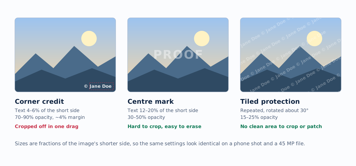
Use a small corner mark (text 4 to 6 percent of the image's shorter side, 70 to 90 percent opacity) when you want credit, and a faint tiled mark (15 to 25 percent opacity, rotated about 30 degrees) when you want protection. A corner mark is cropped off in seconds; a tiled one leaves nothing clean to crop.
On this page
Watermarks do two different jobs, and the right placement depends on which one you need. A credit mark tells people who made the image. A protective mark stops the image being usable without you. Trying to do both with one mark usually does neither well: a mark big enough to protect is too big to look good, and one small enough to look good is cropped off in seconds.
Decide which job you're doing before you open an editor. The rest of this guide gives concrete numbers for each.
Match the placement to the job
| Goal | Placement | Size | Opacity | Typical use |
|---|---|---|---|---|
| Credit | One corner | Text 4–6% of the shorter side | 70–90% | Portfolio, blog, social posts |
| Branding | Same corner on every image | Logo 12–20% of the width | 80–100% | Listings, product shots, marketing |
| Deterrence | Centre | Text 12–20% of the shorter side | 30–50% | Previews, low-risk proofs |
| Protection | Tiled across the frame | Text 3–5%, repeated | 15–25% | Client proofs, stock previews, unreleased work |
Sizes here are percentages of the image's shorter side, not pixels. That's deliberate, and it's how the photo watermark tool stores them: a 60-pixel mark is enormous on a 1080-pixel Instagram export and nearly invisible on a 45-megapixel file. Relative sizing means one setting works for every orientation and crop in a batch.
Corner marks: credit without spoiling the photo
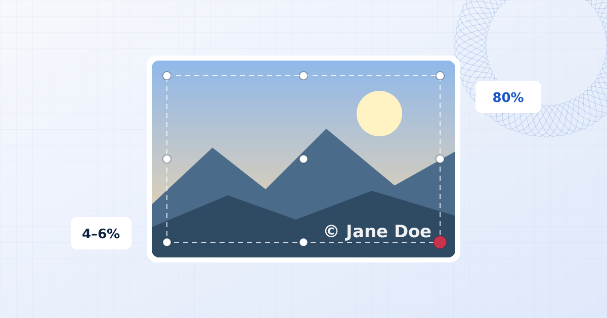
For text, a height of 4 to 6 percent of the shorter side is readable on a phone without dominating the frame. On a 4000 × 6000 portrait, that's a 160 to 240 pixel line of type. For a logo, 12 to 20 percent of the image width is the usual range.
Leave a margin of about 4 percent from each edge. A mark pressed into the corner looks like it is sliding off the photo, and some platforms round or crop the very edge of thumbnails.
Bottom right is the convention, because that's where a painter's signature goes and where the eye finishes reading. But move it when that corner:
- holds the subject or an important detail,
- is the brightest part of the frame (white text disappears against sky),
- varies a lot across the set, so the mark is legible on some photos and lost on others.
White text with a soft shadow stays legible over most backgrounds. When a batch mixes bright and dark corners, a background box at 30 to 50 percent opacity behind the text is more reliable than any colour choice. The editor's Background box slider does exactly this.
Fonts that work small
At corner sizes, simple fonts win. A clean sans serif or a restrained serif stays readable at 160 pixels; a thin script font turns into a smudge. Save script fonts for signature watermarks, where the mark is larger and the style is the point.
Tiled marks: protection that survives cropping
A corner mark is gone after one drag of a crop tool. A mark repeated across the whole frame leaves no clean area to crop to, and covers too much for an eraser to rebuild what's underneath. Content-aware fill works by copying nearby texture into the gap (here's how), and that falls apart when the mark runs over every region of the photo.
To keep a tiled mark from ruining the image:
- Keep it faint: 15 to 25 percent opacity. Clients can still judge focus, colour and expression.
- Rotate it about 30 degrees, so it doesn't line up with horizons, door frames or text in the photo.
- Set the spacing smaller than what someone would steal. The gap between repeats should be smaller than a face, a product, or a logo. If a whole face fits between two marks, someone can cut it out cleanly.
- Use a short string.
© Jane Doetiles better than a full URL and a phone number.
In the editor, switch on Repeat across the whole file on any text or logo layer, then adjust Spacing.
Centre marks: a middle ground with a weakness
A single large mark across the centre is hard to crop away, because the subject is usually in the centre too. It's the classic look for proofs ("PROOF", "SAMPLE"). Its weakness is that it is one solid shape over a known area: if the background behind it is simple (sky, studio paper, a wall), it can often be erased. If the photo matters, tile instead.
Keep it consistent across a set
A set of photos where the mark jumps between corners and sizes looks careless. Three habits keep a set consistent:
- Size relative to the image, never in fixed pixels (see above).
- Anchor to a corner, not to coordinates. A mark anchored "bottom right, 4 percent margin" lands in the same visual spot on a landscape and a portrait. Dragging a mark near a corner in the editor anchors it there automatically.
- Override only where it's needed. When one photo has the subject in your corner, adjust that one photo and leave the shared watermark alone. The editor's Adjust this photo only switch does this, and the photo's thumbnail gets a red dot so you can see which ones differ.
Mistakes that make a watermark useless
- Too faint to matter. Below about 12 percent opacity on a busy photo, the mark disappears and protects nothing.
- Too big to keep. A logo covering a third of the frame makes people unfollow, not respect your copyright.
- Placed on a plain background. A corner of empty sky is the easiest place in the world to erase a mark from.
- Low contrast with the photo. Grey text on a grey wall is invisible. Use a shadow or outline instead of hunting for a colour.
- A different look on every post. Recognition comes from repetition. Save your mark as a preset and use it every time.
A quick checklist before you export
- Is this mark for credit or for protection? Pick corner or tiled accordingly.
- Is the text at least 4 percent of the shorter side?
- Is it legible on the brightest and darkest photo in the set?
- Have you checked the photos where the subject sits in your chosen corner?
- Are you exporting at the size you actually want to publish? Publishing a smaller file than your original is protection in itself.
Frequently asked questions
What is the best opacity for a photo watermark?
For a corner credit, 70 to 90 percent keeps the mark legible. For a mark meant to protect the whole image, 15 to 25 percent is enough when it is tiled, and 30 to 50 percent for a single large centred mark. Below about 12 percent most people stop noticing it on busy photos.
Should a watermark go in the bottom right corner?
Bottom right is the convention and reads as a signature, but move it whenever that corner holds the subject, a bright sky or important detail. Consistency matters more than the specific corner: use the same corner across a set.
How big should a logo watermark be?
For a corner logo, 12 to 20 percent of the image width is typical. Keep it below about a quarter of the width, or it starts competing with the photo.
Does a watermark stop people from stealing photos?
A corner mark mainly provides credit; it is easy to crop. A tiled mark makes an image much less useful to someone who wants to pass it off as theirs, but no visible watermark is impossible to remove. Combine a watermark with sensible export sizes and keep your originals.
Add a watermark to photos
Add a text or logo watermark to one photo or hundreds at once. Drag to position, set opacity and rotation, then export JPG, PNG or WebP. Nothing is uploaded.
Watermark your photos